User interface design portfolio: Course tasks
These are course tasks completed for the User Interface Design Foundations Online Course at Academy Xi.
Course task 1: UI card
The objective of this task was to create a user interface (UI) card for mobile devices by using the provided content (title, sub copy and call-to-action text) and including a published date and an image.
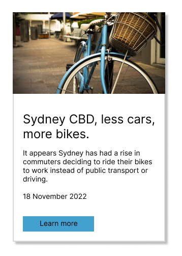
Figure 1 shows the UI card design outcome. The formal news style of the UI card is reflected in the straight lines and sharp corners of the card itself and the call-to-action (CTA) button. A white background with black text also mirrors this news style. A drop shadow around the card indicates to users that the card can be clicked. Inter was chosen as a sans serif font for accessibility and for easier reading on a mobile device. The text and CTA button are left-aligned for the F-shaped reading pattern of users. The use of negative space and different font sizes indicates the visual hierarchy of the content. The image indicates the topic of the news, with the bike in a bright blue color to attract the attention of users. The blue color of the CTA button was selected by sampling the blue color in the image and then modifying the sampled color so that it contrasted with the black text for accessibility.
Course task 2: Set of call-to-action buttons
The goal of this task was to create a set of call-to-action buttons (three levels) for a project using the provided text for the primary call-to-action button.
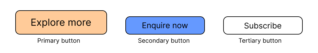
The design outcome for this task is shown in Figure 2. The buttons were created for a website of a landscape artist to show their artwork and to provide information about their art classes. The CTA buttons show a flat style and have straight lines and rounded corners. Inter, a sans serif font, was chosen for accessibility and to allow easier reading of the content on mobile devices. The text is centre-aligned in the buttons. The primary button ('Explore more'; to learn more about one of the artist's courses) is the largest button and has a warm orange background so that it stands out the most. The secondary button ('Enquire now'; to send an enquiry to the artist) is the middle-sized button of the set and has a cool blue background so that it stands out less than the primary button but more than the tertiary button. The tertiary button ('Subscribe'; to subscribe to the artist's newsletter) is the smallest button and has a white background so that it stands out the least.
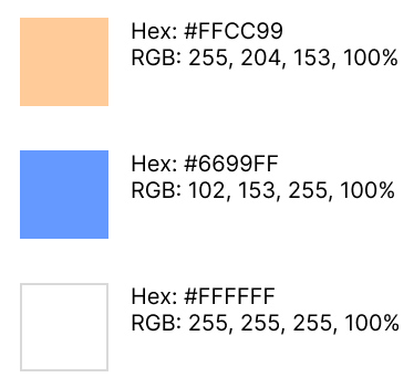
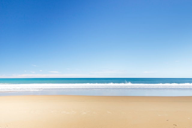
A natural color palette for the buttons (Figure 3) was chosen from an image of a landscape (Figure 4). The blue and orange colors of the buttons were selected by sampling colors in the image and then modifying the sampled colors to be web-safe colors. The colors were also checked for accessibility with black text.
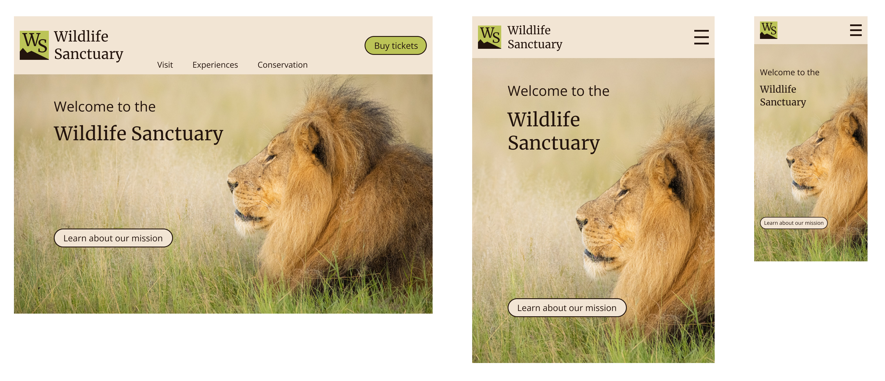
Course task 3: Website header banner
The aim of this task was to create a responsive header banner for a website using the provided text for the header banner and the call-to-action button.
The wireframes in Figure 5 illustrate the responsive design of the website for different screen sizes (desktop, tablet and mobile). Image placement, text alignment, font size and the use of a hamburger menu for the navigation menu in the tablet and mobile designs all contribute to the responsive design. For all of the wireframes, the text and CTA button are left-aligned for users reading in the F-shaped pattern. The CTA button has straight lines, rounded corners and a flat style. Open Sans and Merriweather fonts were chosen for accessibility. The visual hierarchy of the content is shown by negative space and different font and font sizes. The image reflects the website content (i.e., wildlife) and is also suitable for use in the different screen sizes. The colors for the website were sampled from the image and have color contrast and color blindness accessibility.
Reflections
By completing these tasks during the course I was able to practise the skills to create UI design assets that are features of digital experiences. I found that using a combination of features such as typography, alignment and color can improve the visual hierarchy of a design.