User interface design portfolio: Design challenge 2
This course design challenge was completed for the User Interface Design Foundations Online Course at Academy Xi. The goal of this design challenge was to redesign a website or app for a brand, with these requirements: select a brand and redesign their app or website to mid-high fidelity using the same logo and color palette.
Brand identity
Golden Circle is a food manufacturing company that makes a range of fruit and vegetable products. They have been established for many decades, with a strong connection to pineapple farming in Queensland Australia, and they use new initiatives to reduce environmental impacts.
The Golden Circle website exhibits an appealing and engaging design, with bright colors and images of their products. I think the website could benefit from a slight redesign in areas such as visual hierarchy and element alignment to improve the user experience.
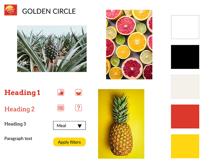
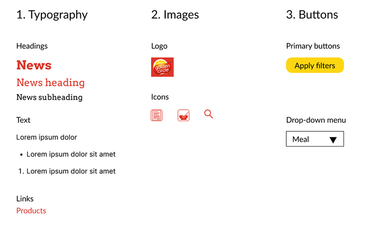
Figure 1 shows the mood board for the redesigned website. The brand logo from the website is included, as well as the color palette, sample images, icons, text elements and a call-to-action (CTA) button.
Style guide
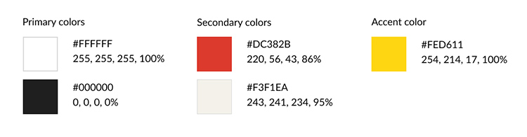
The color scheme of the design solution (Figure 2) includes the main colors from the Golden Circle website. White is the background color with black as the color for most text elements. To improve the visual hierarchy and the user experience, the red brand color is a secondary color for headings, the navigation bar and icons. The light beige color is a background color for areas such as on recipe cards. The yellow color (sampled from the logo) is an additional color for the accent color for call-to-action (CTA) buttons. The red brand color meets WCAG 2.1 AA level for accessiblity against the white background, and the beige and yellow colors as background colors meet WCAG 2.1 AAA level for accessibility against the black text color.
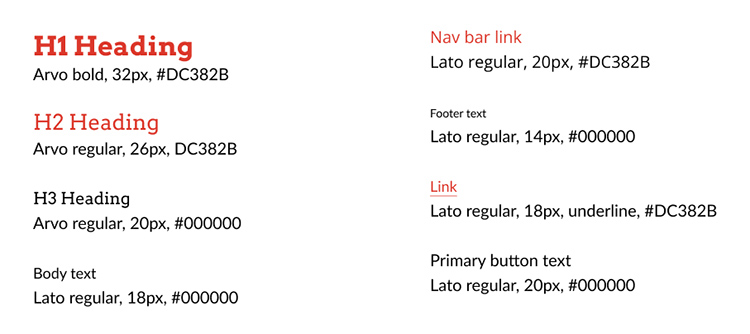
The Golden Circle website uses Verdana and Lato typefaces. The design solution uses the Lato typeface for most text elements, including paragraph text and the navigation menu. To improve readability and visual hierarchy, the design solution uses the Arvo typeface, which is a slab serif typeface, for headings. Using a different typeface, different font sizes and different colors (red brand color or black) for the headings will also help to increase the visual hierarchy of the web pages. The typography guidelines for the design solution are shown in Figure 3.
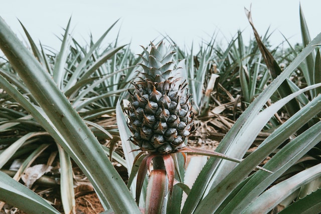
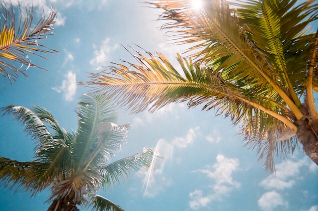
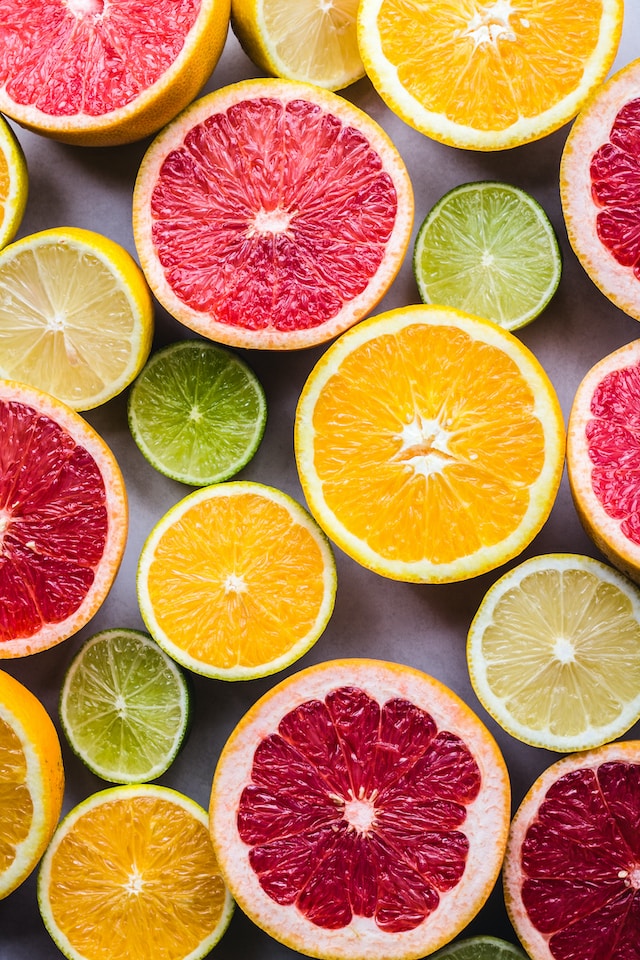
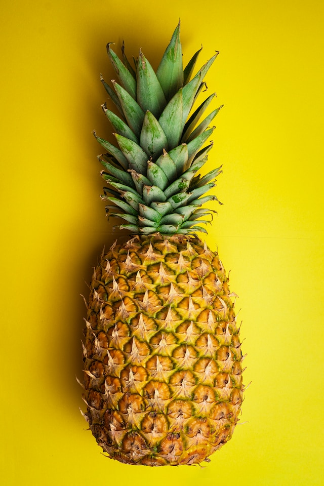
Figures 4 to 7 show images of pineapple plants, sunshine and fruit, which are bright and reflect the brand. In the design solution, the images would be placed in a grid alignment with sufficient white space around each image and in proximity to the related text content.
Icons for the design solution are displayed in Figure 8. These icons are indicators to mark sections for users and are designed in the red brand color.
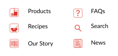
Figure 9 shows the interface inventory, which includes elements that make up the design solution interface. The design pattern of the primary 'Apply filters' CTA button is shown. This button enables users to apply the selected filters to the list of recipes. The shape and accent color of this button make it stand out to users as a clickable button.
Wireframes
The basic layout of the design solution is shown by low-fidelity sketch wireframes of the website in Figure 10. Several web pages, including 'Products', 'Recipes', 'Our Story' and 'FAQs', are shown in the sketch wireframes, with some navigation paths also included. The website redesign illustrates the cleaner, consistent alignment of elements on each page to improve the user experience.
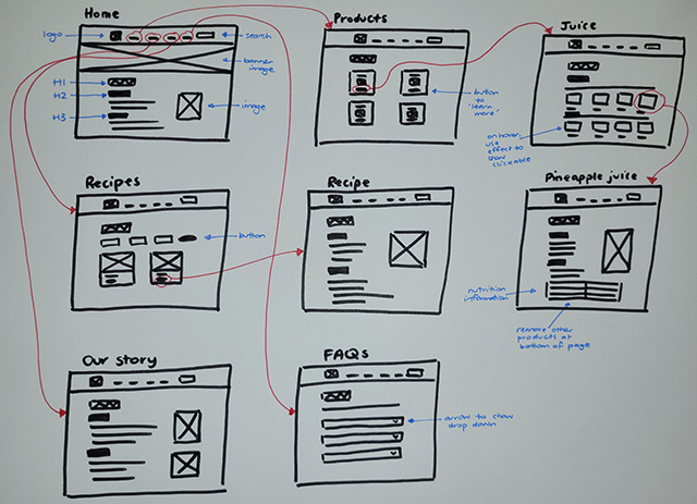
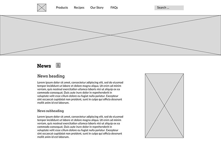
Figure 11 displays a grayscale high-fidelity (hi-fi) digital wireframe of the home page, with the interface elements in clear alignment. The use of different fonts and font sizes, as well as proximity of elements, improves the visual hierarchy of the page. To follow web conventions, the logo is placed at the top left and the navigation menu is also located at the top. The redesign shows an updated navigation menu order, in which 'Products' is placed before 'Recipes' to keep the focus on the brand's products rather than recipes. The search function is clearly indicated by a box with the text 'Search ...' in the top right. Also, the addition of the 'News' icon placed next to the 'News' heading is a clear marker for the content.
Prototype
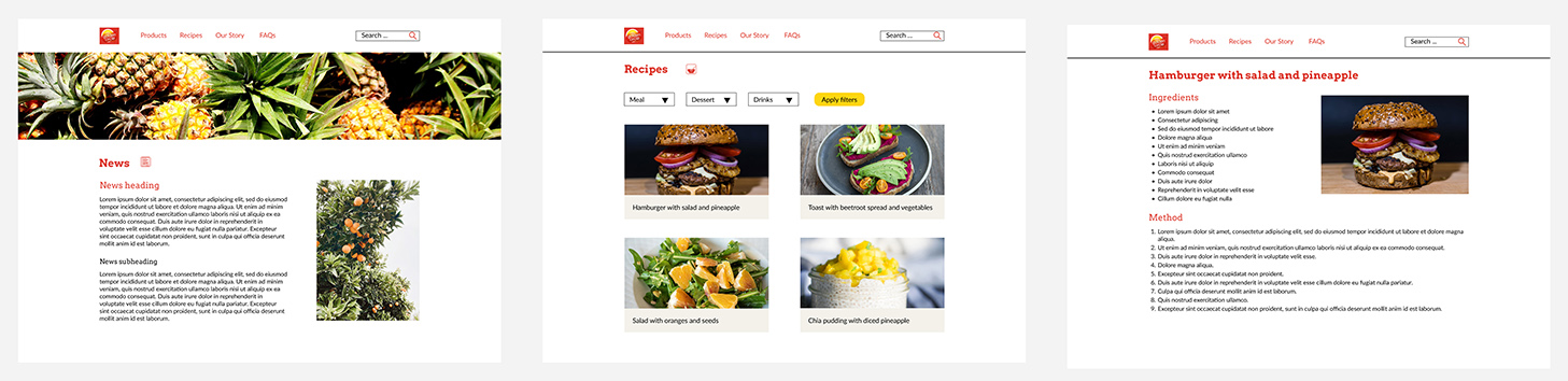
Figure 12 shows the prototype of the website redesign for the home page, 'Recipes' page and a sample recipe page. The text elements are left-aligned and the use of different typefaces, font sizes and colors helps to distinguish the visual hierarchy of the page. The use of white space and proximity of interface elements also helps to create visual hierarchy. The prototype illustrates the use of the 'News' and 'Recipes' icons to help flag the content. The use of sample images helps to create a visualization of the redesigned website. The yellow 'Apply filters' button on the 'Recipes' page is a clear CTA button for users.
The prototype would display web responsiveness by incorporating a redesign to suit the smaller screen sizes of tablet and phone devices. These devices have less screen space and so the website would need to have a focus on vertical content and less white space. Also, the top navigation bar would be replaced with a hamburger menu. The recipe cards would be a smaller size and would be stacked on top of each other on phone screens. Smaller images and font sizes would also be important in a responsive design.
Reflections
I found it interesting to look at a brand's website and identify areas that could be improved based on the UI design skills that I had developed through the course. I'm pleased with the design solution, in particular the visual hierarchy.