User interface design portfolio: Design challenge 1
This is a course design challenge completed for the User Interface Design Foundations Online Course at Academy Xi. The objective of the design challenge was to create a digital experience for a brand name 'Crystal Wolf', from these requirements: select an industry, design a logo and create a prototype of the website that includes free stock imagery.
Brand identity
Crystal Wolf is a travel company that provides customers with a range of travel packages. Their mission is to help people connect with nature and experience travel in a calm, relaxing and refreshing way. The business is based on supporting customers to embrace nature and fresh air, disconnect from technology, slow down and reset, and spend quality time with family and friends. The company's values are honesty, customer focus, trust, responsibility and respect. The business name 'Crystal Wolf' reflects these characacteristics: 'Crystal' is associated with words like 'water', 'clear' and 'transparent', and 'Wolf' is linked to words like 'bold', 'brave', 'strong', 'loyal' and 'teamwork'.
The business represents modern and sleek terminology, with designs of minimal content and a color scheme of mostly black, gray and white with highlights in blue or green colors. The designs are also engaging with large photographs of landscapes.
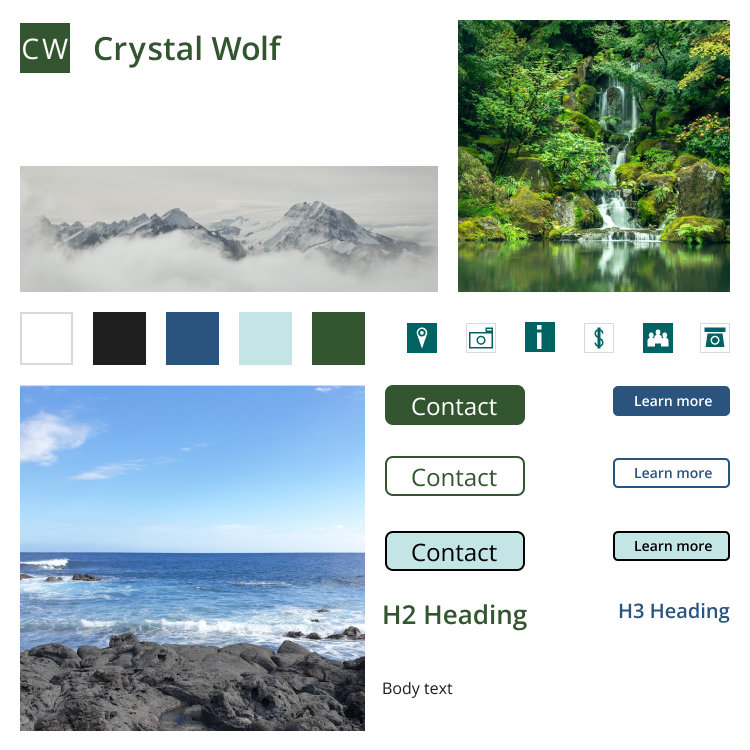
The mood board for the design solution is shown in Figure 1. It displays the designed brand logo, color palette, typeface, icons, buttons and text elements. Sample images are also included for inspiration for a potential client.
Style guide
The brand voice of the business is described as welcoming, helpful and clear. 'Welcoming' is illustrated by using language that is warm and invites customers to develop a connection with the brand; for example, 'Thanks for subscribing to our newsletter! We look forward to sharing our latest news with you in the future.' The 'helpful' feature of the business is shown by providing information that will help customers enjoy their experience, from their initial contact with the travel experience to an ongoing relationship with the brand; for example, 'These useful travel tips will help to make your journey a calm and relaxing experience.' The 'clear' part of the brand is exhibited by using simple direct language that can be easily understood and avoiding complex language or jargon; for example 'Thanks for your message! We'll get back to you within one business day.'
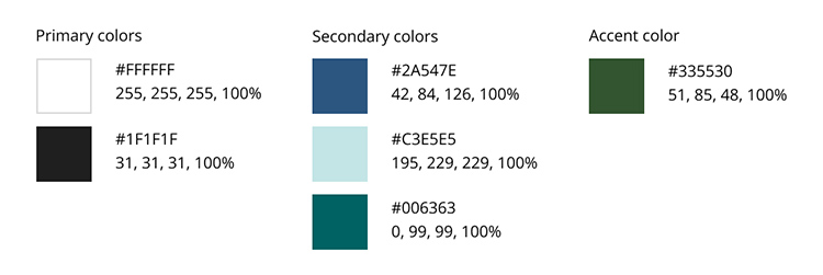
An analogous color scheme (Figure 2) using blue, blue-green and green was developed using colors sampled from the photograph in Figure 5 below. The sampled colors from the photograph were slightly modified to improve contrast for viewing by people with color blindness. These modified colors were then tested for color and contrast accessibility; the color of interface elements meet WCAG 2.1 AAA level. This color scheme together with the neutral colors of white and dark gray aligns with the mission and values of the Crystal Wolf brand.
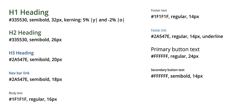
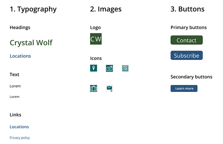
The typeface Open Sans was chosen for good accessiblity and for reflecting the clear brand voice of Crystal Wolf. The use of one typeface ensures a simple and consistent presentation of the Crystal Wolf brand. Figure 3 displays the typography guidelines for the website.
The Crystal Wolf logo (Figure 4) is a simple logo using the Open Sans regular typeface, reflecting the clear brand voice. The logo is to be mainly used on light backgrounds, with secondary use on dark backgrounds.
The sample images (Figures 5 to 8) reflect the mission of Crystal Wolf, with locations from a range of natural settings including beaches, forests and mountains. The calm and relaxing landscapes align with the color scheme. Image placement should ensure there is sufficient negative (white) space surrounding each image so that the user is drawn to the landscape shown in the image. Ideally one image is used per concept to align with the clear brand voice of Crystal Wolf.


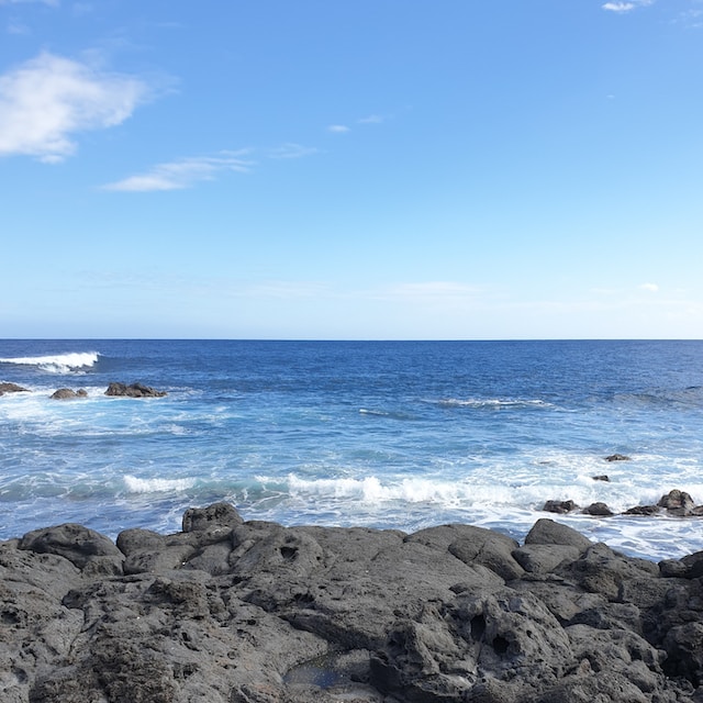

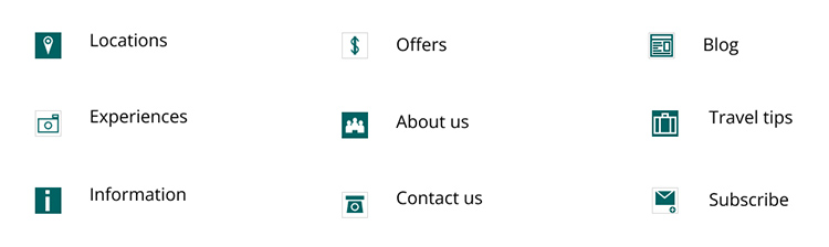
Figure 9 shows the icons, which are clear and helpful indicators of content, aligning with the brand voice of Crystal Wolf.
The interface inventory is displayed in Figure 10 and shows the elements that create the website interface. An example of the design pattern of the secondary 'Learn more' button is shown. This reusable solution enables users to find more information by clicking on the button. This creates a gradual reveal of information as the user needs to learn more information.
Wireframes
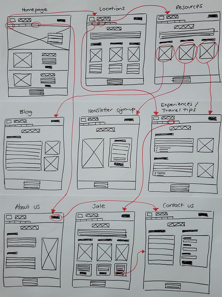
Low-fidelity (lo-fi) sketch wireframes of the website (Figure 11) show the basic concept of the website design. The multi-page website has several pages, including 'Locations', 'About us' and 'Contact us'. Some navigation pathways are indicated by the red arrows.
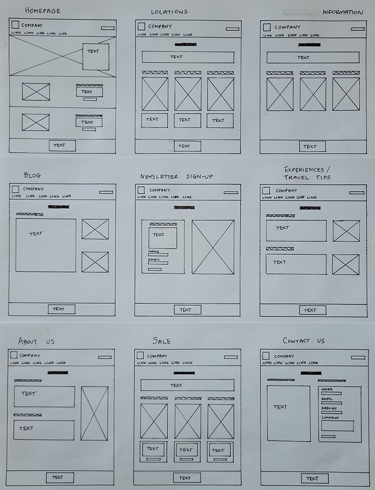
Presentable sketch wireframes are shown in Figure 12; these wireframes present a refined version of the lo-fi sketch wireframes. The layout is more clearly indicated with straight lines and aligned elements. From these wireframes, it is clear that the home page could be improved by larger images and the careful use of blue or green colors for highlights.
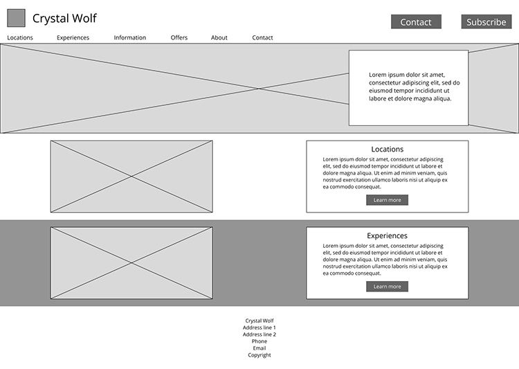
A grayscale high-fidelity (hi-fi) digital wireframe of the home page (Figure 13) demonstrates the overall layout of the page. Following web conventions, the logo and company name is at the top, with the horizontal navigation bar located directly below. Buttons for 'Contact' and 'Subscribe' are located at the top right of the page for users to easily access these common features across the website. Images and text blocks are repeated elements and are aligned to create consistency. The visual hierachy of the page is reflected in the placement of elements, font size and order of elements on the page.
Prototype
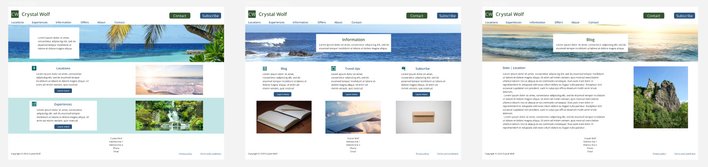
Figure 14 shows the prototype of the website: the home page, 'Information' page and 'Blog' page, with navigation interactions indicated by the blue arrows. The design has evolved further from the grayscale wireframe of the home page. Blue underlined links for the 'Privacy policy' and 'Terms and conditions' are positioned at the bottom of the page, following web conventions. The call-to-action (CTA) buttons have rounded corners to draw attention to the button text. The text blocks are left-aligned for consistency and to follow the F-shaped reading pattern. Sample images are placed to help the business visualize the target product. Icons are included as markers to indicate topics, and color, font size and proximity are used to create visual hierarchy.
A responsive design for the prototype would involve designing the website for tablet and mobile phone screens as well. These designs would include a hamburger menu in the top right to replace the navigation menu, smaller font sizes and smaller images to adapt to less screen space on these devices.
Reflections
This design challenge enabled me to apply the skills that I learnt throughout the course. I'm happy with how the overall prototype came together by applying visual hierarchy, alignment, color, typeface and icons to create a meaningful user experience.